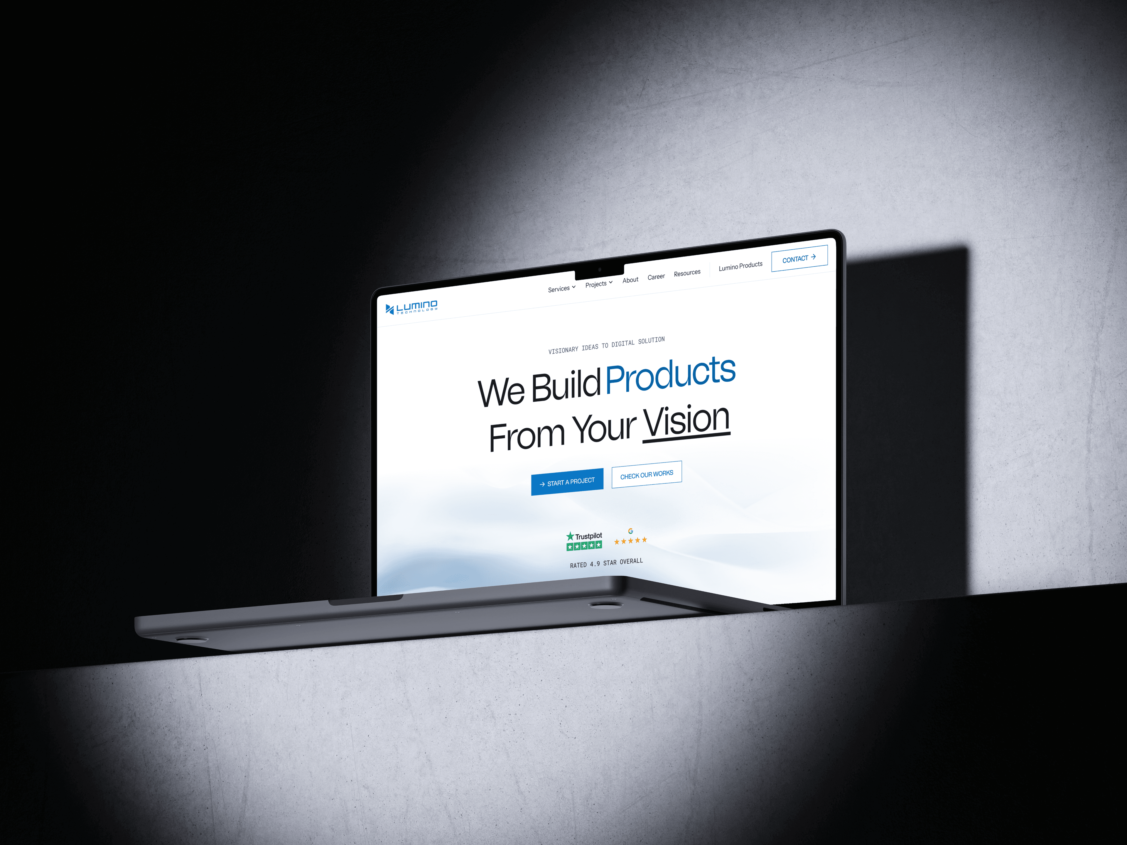
The existing website needed a clearer way to communicate its services and help potential clients find the right solution.

 digital products.that feels Simple.
The existing website needed a clearer way to communicate its services and help potential clients find the right solution.
Clear, responsive websites that balance usability, content, and visual impact.
Complex dashboards and workflows simplified for faster, easier day-to-day use.
Digital products designed around real user needs, scalable flows, and thoughtful interaction.
Visual identities and brand systems that create a clear, consistent, and memorable presence.
Reusable components and patterns that keep products consistent as they grow.

At WiseAdmit, I design end-to-end digital experiences across education, AI, and document management—from research and user flows to high-fidelity UI for websites, portals, dashboards, and landing pages. I also built the product design system, creating a consistent foundation and solving complex user and product challenges through research-driven design.
I’m Ishan Mishra, a UI/UX Designer from Nepal. I don’t just make things look good, I figure out what’s broken, why it confuses people, and how to fix it at the root. Then I make it look good too.
I work with founders, startups, and businesses who need design that moves the needle but not just a prettier version of the same problem.
Play Cube Crush